Remember this post? Well, I should have listened to you guys. Obviously.
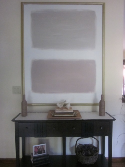
I made my choice based on how I wanted the room to feel. I decided I wanted the room to feel calm and peaceful, so I chose to create a Mark Rothko inspired painting. This canvas is huuuuge so I thought a soft & simple piece of art would have impact, but not take over the space. I used some left over paints from our bedroom and mancave living room so the colors would reflect the other rooms in the house to make it feel cohesive.
Here are a few Rothkos. See where I what I was shooting for???


Here’s mine.
Mr. FSL: What are you going to do to that canvas next?
Me: It’s done.
Mr. FSL: *Funny Expression On Face*
Me: You don’t like it?!
Mr. FSL: * shrugs* yeah
Not too convincing.
What do you guys think? Back to the drawing board with this one? Keep it?


Maybe add some bamboo stalks to it, or some tree limbs. That oughta jazz it right up!
I would have thought it was paint colors you were trying to decide on for the wall. Sorry!
I think the colors are too pale – I would either brighten them up or add something to it like flowers or butterflies to give it some life. Good luck!
I like where you’re at! I would only suggest adding a little bit of depth, some lighter and slightly darker tones to pull out some dimension. Actually, the more I look at it, the more I really like it. If YOU don’t love it change it! If you’re proud of it then keep it!
I have trouble getting the right response out of my husband for my decorating/paintings/whatever. It usually goes something like “Do you like IT!!!!” “Uhhh, yeah. its cool” Then I’m left wondering why he wasn’t jumping up and down with excitement.
The painting is nice. But not in that spot. It’s too bland monochromatic almost..hmm….
Oh girlfriend, I am not lol at you really… I like The Scene from me’s suggestion, you can try that, it just lacks life no vibrancy. I love the idea it is very cool, and simple just needs different colors or a touch of umph.
Good luck with this one.
Leila
The design is okay, I think it needs a little more contrast. The colors remind me of drywall that has been spackled or primed.
I actually looked at photos of some drywall just before I saw your painting!
HAHAHAH! The photo doesn’t show the best lighting. It a pinky brown & tan…..yeah, lol, I gues it does look like framed drywall! Hahahahah!
I think if you did an unexpected colour to fill the middle gap and fade out it could look really cool.
I am way to excited that you came to visit me!!! I have some new ideas brewing!! Thanks for the input T!
xoxo
Mindy
I need a larger view of the room to pass full judgement but I like it!..and you know I’d be honest with ya!
How do you feel about it? Husbands sometimes need to get used to things before they can fully appreciate their beauty. 😛
hahhahaha. MEN
Husbands! I have one of those skeptical guys at home too. He usually figures out that I was right, though. 🙂
Isn’t that the best?! When they finally see the light.